Blog

Jan 6, 2017

I’m often asked by clients, students or creative friends…where do I go for inspiration, resources, best practices or the latest whatever? Or is it a bad thing, leading to copycat ideas or a rehash of the latest “everyone’s doing it so it must be good” look?

****

DESIGNER CAVEAT: It never hurts to be aware of current visual trends or see what designers are sharing, but don’t overdo it. Many great concepts have been marred by typographic overuse of the Bernhard Moderns of the ’80s, Copperplate Gothic of the ’90s, Helvetica Neue in 2000, or those pesky quadrant hipster logos (yup, it's okay to nod knowingly). There’s an inner danger of looking too long or too often at designer greatest hits or Pinterest-style visual blogs without initiating your own creative morals or standards.

Don’t get me wrong, I admire beautiful, smart design and love the motivation it gives to kickstart strong work of my own. However, anyone who “borrows” too much of the same thing perpetuates those same visual parallels for the next. Certain visuals could get embedded into the recesses of the mind, plausibly brought forth without realizing the origin. Then there are those who say that truly new ideas are impossible with social media or that tribute or reinvention of any degree are equally fine and well. Thus, it would be a shame to work up a design idea only to discover that it’s already been done or worse yet, much better. Backpedalling is never a positive outcome, and neither is falling into a formula or having your work mistaken for someone elses. Perhaps it would be different if it happened by sheer coincidence, but even then, watch out especially if it’s a paying job. Bottom line for me? Design books work as a catalyst for inspiration to adopt methodology, problem solve by example and healthy competition via self-regulation. Using it as a source for covert plagiarism however, isn't.

****

So what to do? Wordplay. Mind maps. Too boring? Go elsewhere. Try a new start. Don’t think like a designer; think like the end user. BE the end user. Good ideas are everywhere, sometimes where you least expect it. Whether observing nature, going out for a run, taking a nap or looking at something totally outside of design execution. Think different(ly). Take a break. Take time. Fear, jealousy, and frustration are surprisingly great creative motivators. The desire to be influenced by nothing or no one. Start with the genesis of a design idea. Or even a germ of an idea and build upon it. One leap forward, 2 steps back, repeat. Look at things abstractly via structures, science, basic shapes, or even pictograms where communication is forced down to it’s most basic, essential elements. Like the beauty of a single Twitter message, force yourself to make points more succinct and stronger with less.

When I want to ideate (that is, briskly deliver a continuous string of design iterations), I may flip through quality design sources to get myself into a certain high level frame of mind, focussing on a design piece to trigger another thought. That's a creative approach I like, to force different ways of looking at things as a competitive challenge. For example, I may explore experimental typography to crack a logo problem that requires a change in visual perspective, international poster designs for bold color palettes, or publication design for illustrative approaches to typography. Other times, even the act of PLAY can make a difference. We used to do it as kids to understand relationships and make new discoveries or connections. Play as an adult might look different with a more refined set of tools, but the freedom and non-judgmental environment can lead us down that same path of reward.

On the other hand, there are those tangibles that encourage original thinking and learning from some of the best and the brightest. What are my top fave design books? It’s less about actual titles as it is the KIND of books I like to turn to time and again. (Almost all of these—except those sold online by independent publishers—are readily available from public libraries.)

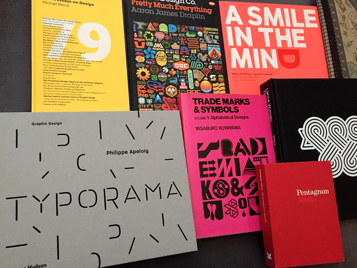
HOW TO THINK BOOKS. “Smile in the Mind” (revised edition) by Beryl McAlhone and David Stuart. Debbie Millman’s “How to Think Like a Graphic Designer”. “79 short essays on Design” by Michael Beirut. “Designing Design” by Kenya Hara. Reading any or all of these is like giving your brain a little hug.

MENTOR IN A BOOK. Eric Karjaluoto’s “The Design Method” is a winner. Same for “Design is a Job” by Mike Monteiro. “How to be a Designer Without Losing your Soul” by Adrian Shaughnessy. Very affirming and meditative after experiencing unethical design behaviours with past collaborators. Those instances were disappointing, frustrating and alarming, which is why I insist that sketching is far more valuable than just a digital file one can edit and rename to change the course of history. Sharing or giving credit where due is always okay and right. Slander or lying can blow up in faces and damage reputations in the long run.

MASTER COLLECTIONS TO ASPIRE & INSPIRE ON YOUR OWN JOURNEY. Whether it’s a massive collection of everything that is 1000% awesome in a single coffee table book like “Logo Modernism” by Jens Müller or following along ones life’s work in “Logo Book” by Stefan Kanchev or “Lance Wyman: The Monograph” by Unit Editions, these kind of books are life-changing and utterly encouraging for me. It’s a reminder that there are always more than one way to do something, and that the only limitations hindering our progress are the ones we put in the way. Even those still pushing boundaries in their current work, are worthwhile in selections like “Make it Bigger” by Paula Scher, “Made you Look” by Stefan Sagmeister, “Typorama” by Philippe Apeloig, “Pretty Pictures” by Marian Bantjes and “Pretty Much Everything” by Aaron Draplin. These design powerhouses all share common threads. Their work may vary stylistically over the years, but there’s a consistency worth celebrating. Plus, they always manage to put a bit of themselves into everything they do (intimate self-portraits notwithstanding).

PROCESS BOOKS. “How to” by Michael Beirut isn’t a literal step-by-step guide the way Jessica Hische’s “In Progress” is at times, but both are highly valuable references for all levels along the path towards successful, confident design outcomes.

TIMELESS CLASSICS or OLDIE BUT GOODY BOOKS. That saying of “while they zig, you zag” is why I often revisit the craft of early Charles Spencer Anderson/CSA Design/French Paper collections (from 1985-2005 most are out of print). I’m enamored by the idea of past history teaching us basic fundamentals for the future, so I’ve been digging into really old logo collections from the 60s & 70s. Rare classics like “Trademarks & Symbols” by Yasaburo Kuwayama or older Scandinavian and German logo collections like “Signs & Signets” by Stiebner & Urban make one marvel at the exquisite graphic forms and pre-computer era (hand drawn!) designs. Aaron Draplin encourages a sentiment I share of looking at design from all kinds of sources, particularly very old print pieces where they got really graphic and really simple with lowest quality printing or design resources (e.g. drawing and typesetting by hand). I even found one on my desk in the form of a self-inking rubber stamp! The act of looking, never ceases to be an underrated but vital skill for anyone.

I can’t emphasize enough; DO NOT ripoff or directly copy others. YOU are you, and you can make your living by what YOU can offer to your utmost abilities. The past model of how we used to be taught was by duplicating masterworks or doing a riff of their past successes. But the reality is that we can NEVER match them, nor should we. And did these masters truly learn by copying? Perhaps a little when they were young getting their feet wet, but more often than not, NO. They got frustrated with what was the norm or status quo and already formed a vision in their mind of what they wanted to discover and release from within. But as experienced artists or photographers I’ve had conversations with all strongly encourage….Do not copy. Find your own voice by learning HOW to think and HOW to understand structure so you can DO YOUR OWN work. Likewise for design, I shared my own referrals of what works for me. Maybe it’s a start for you but I encourage you to find your bliss and follow the beat of your own drum. That is my best recommendation.

Nov 22, 2016

SO YOU WANT TO PUBLISH A MAGAZINE? by Angharad Lewis

This great, unique book focuses on the stages to create a modern magazine while keeping your creative voice & independence alive

Remember the days when we used to read magazines? Physical, on-actual-paper magazines? We'd visit one of many newsstands or had our subscriptions delivered right to our door. We'd read them on transit, on holiday or in the bathroom and then recycle, donate to public libraries or give them away. But then publishing moved online. Then we started reading them on our tablets. And then magazine publishing stopped. Or did it?

The current trend for print magazines—particularly embraced by the creative community—are not the disposable kind. They've been elevated to "keeper status" with unique content that is timeless in tone, created by independent publishers driven by creative freedom. Less reliant on mass marketing, with walls of advertising printed via industrial-sized web presses, the modern magazine is about a particular discerning target reader. Produced with minimal sponsorship or no advertising, and high quality production values, each issue may be priced at a premium equivalent to a hardcover book. The difference is that people are willing to pay for this premium, with the full intention of keeping these publications for longer than a periodical.

That is what this unique book focuses on...the makers of these kind of modern magazines, the quality of design & content that make them so sought after and what it takes to keep them alive. Author Angharad Lewis leaves no stone unturned, bringing up the differences in being independent with your own unique voice and goals, working outside of the confines of mass market print and distribution channels, and relying on every facet of community to get it launched towards sustainability. Like a valued mentor-in-a-book, the introduction kicks off with both encouraging and sobering tones, reminding aspiring magazine-makers the wealth of opportunities that await them, coupled with unforeseen challenges to be prepared for along the journey. Interspersed with frank interviews by magazine makers of all kinds (including Monocle, Disegno, The Gentlewoman, & Eye), the author also explores and compares the benefits between reading and promoting via print, digital & social media platforms, and alternative, innovative modes of distribution.

The challenge for today’s magazine entrepreneurs is ongoing at a variety of stages: how to stay relevant, how to be viable financially or as a full-time business, how to offer something different from book or blog competitors and how to maintain their offering (whether it be based on quality of content, design) at a price point that works for creator and target audience. This book validates the fact that print is not dead (thankfully). It has evolved into something wonderfully different, tenacious, and ever-changing. And to a degree, that’s what magazines and its creators need to be as a whole to stay alive.

Nov 22, 2016

2016 is turning out to be a most interesting year to say the least. Many great projects, creative opportunities, and terrific people to work with. Some brilliant design/typography conferences to satisfy the soul, along with continued personal growth and learning. I've shared much of that on Instagram over the summer months. However, the year is winding down with so much change in the air as well days of grey rainy clouds. All the more of an excuse to tuck into some reading, update work on my website (what little can be shared until public launch) and catch up on overdue writing! There's been so many great titles added to the design library worth sharing and recommending. I'll be adding more content here in the following days and work at some different kind for entries for 2017. In the meantime, please enjoy.....

-------

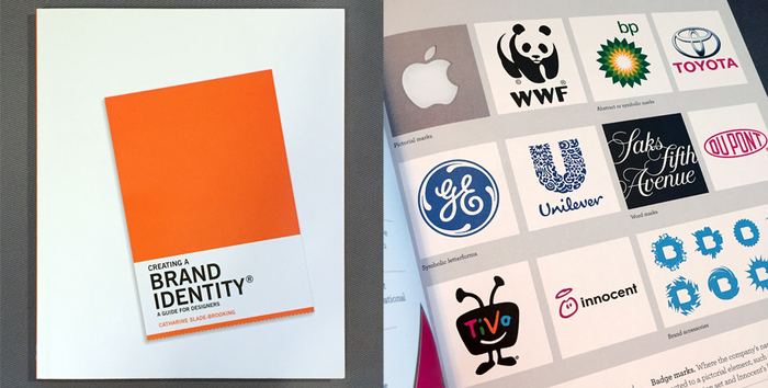
CREATING A BRAND IDENTITY: A Guide for Designers by Catharine Slade-Brooking

This is essential reading for any brand design student, startup, marketing manager or design professional. It is a thorough, comprehensive introduction and resource from start to finish, but thankfully not a verbosely dense tome. This 160-page guide is primarily a portable, easily accessible textbook with real-world exercises for students or junior account brand managers alike.

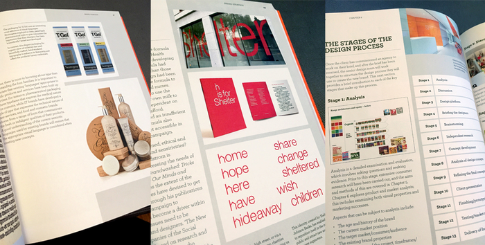
Very enjoyable with plenty of international case studies and presentation examples to reinforce points and typical scenarios one would face in the sometimes long, drawn-out journey of crafting a brand identity. Not heavy on process from a design perspective, but brand-centric from throughout, with some encouraging yet realistic words of wisdom (“process is more of a marathon than a sprint, requiring long-term building of brand").

Author Catharine Slade-Brooking, who has plenty of industry experience in branding, packaging and illustration under her belt, outlines eight logical chapters: branding basics, brand anatomy, brand strategy, the design process, research, analysis, concept development and delivering the final design. Slate-Brooking includes many good details to consider (e.g. knowing cultural norms when branding for a country outside of your own), and strategic pointers on how to successfully launch a brand from a creative perspective. Exercises and examples highlight the key activities undertaken by designers to create a successful brand identity, including defining the audience, analysing competitors, creating moodboards, naming brands, designing logos, presenting to clients, rebranding and launching the new identity. Filled with many good visuals throughout (sometimes too small to effectively illustration certain points), there is also a vital smaller section exploring the creative side of developing creative concepts. This guide, filled with many words of experience, is like a trustworthy mentor in book form.

Overall this is an excellent, practical and most useful resource for anyone involved in any stage or area of branding. The up-to-date current content includes every step from client/account relations to creative process to brand management, audits, launches, etc. to successfully launching a brand identity from beginning to end. It doesn’t continue on with what happens after the launch (maintaining and nurturing the brand in the months or years following the launch) but nevertheless, this book is definitely a keeper and very recommended.

Jul 9, 2016

I love Typography. When I showed my portfolio around during my final year at design school, I was encouraged with these words, “Your work and attention to detail is great. Don’t forget about type. Poor typography can really take down good design ideas, so pay attention.” I’ve kept that close to mind since and up to this past year. I’ve had my nose down to the grindstone working hard, long hours, ensuring typographic choices were always considered from both style and historical perspectives, as well as accessible (readable, affordable, cross-platform and within all brand applications). I also didn’t want to burn out creatively from overwork either.

I began paying attention to online resources for learning, stumbling upon videos from the Type@Cooper program in NYC. That led me to the Typographics design festival at Cooper Union, which debuted last year. I don’t attend conferences as often as I would like, but It’s been 7 years since I was last in New York, so due time for a return to a city overflowing with designers, typographers, galleries, and creative folks. As a regular member of Vancouver’s Type Brigade meetup, my friend Riley Cran was also going to be a speaker. What better way to represent and support, as well as get invaluable inspiration, experiences and learning? Suffice to say, I was already stoked.

Arriving in NYC, the energy was palpable. The noise, the people, the traffic, the food (!), the architecture, the wealth of excellent galleries/museums and the wide range of cultures. Typographic design influences were everywhere, as evidenced by modern and historical works alike in subway advertising, storefronts, packaging, carved facades, graffiti, and especially building signage. Everything is vying for your attention, and BIG or LOUD is the preferred visual language. I kept busy capturing as much as I could, posting images on Instagram and soaking all of it in to take back with me. So too, was the positive impact of attending a type design conference where most presenters were already working and living in Manhattan or Brooklyn.

The range of Typographics speakers included those starting out designing their own fonts, to seasoned type designers, to those looking into the past exploring deeply into type ephemera or through career achievements, right to those with their eye on the prize towards the future. The conference talks were eye-opening, aspirational, experiential, and entertaining as expected; often meaningful, thoughtful and personal too. Many speakers were brilliant storytellers, while others let the work do most of the talking. I was pleased most of all that each person on stage—whether from Brooklyn or by way of Thailand, UK, Germany, Italy, Spain, Mexico or Canada—had made typography a passionate, vibrant and always integral part of their life’s work. They are each interesting individuals and thus, their desire or personal calling to make typography a strong, positive influence in what they do and HOW they do it is evidenced in everything they thought about or shared.

That was also true with Herb Lubalin, of whom I am equally ashamed and grateful to discover so late. During my design school education (which lacked any design history in the curriculum), I was unapologetically entranced and influenced by Duffy Design & Charles Spencer Anderson, that graphic retro illustration, xerox machines and brown kraft paper was my main design jam. Years later, I am pronouncing LOO-BAAHL-LIN properly and appreciating his many contributions to design with a student-like curiosity and fervour.

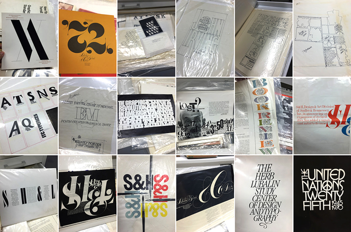
I was fortunate to get a self-directed tour of “The Herb Lubalin Study Centre of Design & Typography” (aka the Lubalin Center) in the gorgeously curvaceous Cooper Union building across from the original Foundation Building where the 2016 Typographics conference was held. For 2 hours I was given access by curator, Sasha Tochilovsky, to explore the vast wealth of materials gathered and contributed by various parties that built up this fascinating collection. Drawer after large map drawer of Lubalin’s sketches, tracing paper composites, pasteup boards, PMTs (high quality solid black prints on photographic paper), negatives, tearsheets, brochures, postcards, stationery, outtakes, advertising, logos, type designs, posters, articles, and so on. Basically his entire life’s design work and process is there, along with smaller collections from other designers of similar calibre (Phillippe Apeloig, Alexey Brodovitch, Karl Gerstner, Tibor Kalman, Milton Glaser, Paul Rand, Alvin Lustig, Chip Kidd). I felt like I was a private investigator, design journalist and archivist all in one. This visit was visually documented here.

It was NOT hard to fill those 2 hours as I explored every single piece with the attention it deserved, as though it may be my last chance. The opportunity for archives like this to exist for the public good, and to be maintained and nurtured so lovingly, at a place where quality typography courses and lectures (some captured on video and posted online) is a testament to how highly regarded the Type@Cooper program and school is. Two of the speakers at Typographics (Emily Oberman of Pentagram and Stephen Doyle) were proud Cooper graduates. Their high level of passion and talent for what they continue to create demonstrates how much typographic design impacts everything they do. As I write this, I am hit with a wave of gratitude for having attended and still feel how much it has influenced me even after a month has passed.

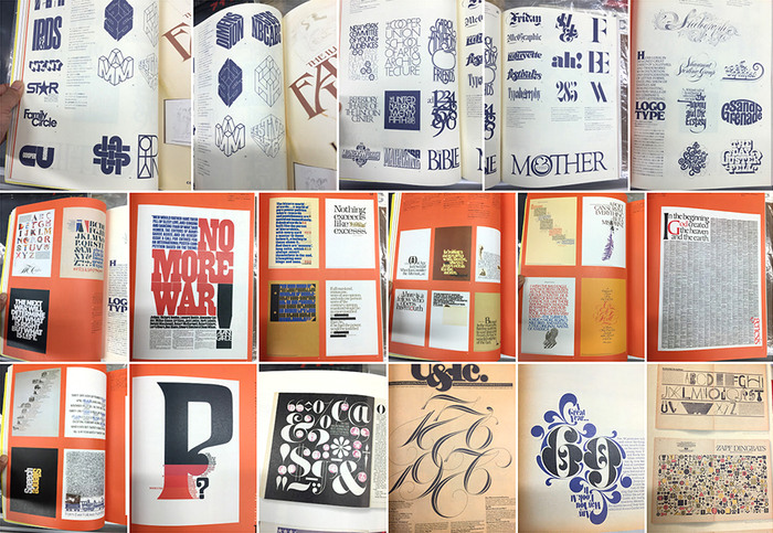
For those unable to visit the Lubalin Center in person, or Letterform Archive in San Francisco (a similarly much larger archive from worldwide masters), there are options. Both have visual archives on their respective websites and Instagram. Alternatively, UK design book publisher Unit Editions has just released Herb Lubalin: Typographer. I received my copy upon my return from NYC and it’s much of what I saw in the drawers in an affordable and beautifully designed book.

So what’s next? There’s Typecon Seattle, and one day I would love to attend Brand New Conference (their 2010 & 2011 videos are now FREE, btw) although Typographics 2017 is definitely worth another NYC visit! So many conferences, so many typographic options... I hope you find yourself attending a conference too, gaining and sharing inspiration with others to spread the beauty & potential of typographic design!

LINKS:
https://vimeo.com/coopertype/videos/
http://coopertype.org/nyc/
http://2016.typographics.com/
https://instagram.com/nancywudesign/
https://www.flickr.com/photos/lubalincenter/
https://goo.gl/photos/6srsTezxZ7CgQ6Ry7
http://flatfile.lubalincenter.com/
http://letterformarchive.org/gallery-1/
https://www.instagram.com/lubalincenter/
https://www.instagram.com/letterformarchive/
https://uniteditions.com/collections/all-1
http://www.typecon.com/
http://www.underconsideration.com/brandnewconference/video/inventory/

Nov 13, 2015

I’ve learned over the years that being a freelance designer definitely has its ups and downs. The work—when it comes—is rewarding. I love collaborating with supportive clients and brilliant creatives, researching fresh points of view, exploring valuable ideas, and being appreciated for my contributions. Then there’s the dreaded stress (or relief?) of downtime when the frenzy of quick turnarounds, obsessing over details, and intense problem solving become a fond memory. Suffice it to say, this reality forces me to be agile, adaptable and patient wherever possible during these periods, even if I don’t always like it. What I DO like however, is continually learning new things and developing skills. This downtime ends up becoming a benefit and a blessed opportunity to get back to basics. Computer maintenance, archiving files, clearing out materials no longer needed, brushing up digital skills, meeting friends for coffee, and getting busy doing things by hand.

Developing ideas with pen & paper isn't entirely new, as I often start brand identity concepts by sketching quickly and in quantity—this part of my job I love, but don’t nearly do enough of. Yet the act of drawing, sketching and lettering by hand is enormously popular, as Pinterest and Instagram feeds have evidenced. It’s a refreshing, cheap break from solid computer work that can be integrated back into digital design via Photoshop and other e-tools. The feeling of brisk experimentation, exploring new challenges, creative discoveries, and just doing things for the love of it versus following specific directives, is both cathartic and fulfilling from a personal growth perspective. It also brings forth a unique human identity, voice or personality to the creative product. Leaving one’s own imprint is what many strive to do, moreso in this DIY age where anonymous workers of big corporations diligently build with almost no acknowledgement or notice.

Some books I’ve read recently identify gifted designers & illustrators, explore the importance of working by hand, and demonstrate how vital hand skills are to the creative process, not just ideas alone. Jessica Hische’s debut, “In Progress”, "David Downton: Portraits of the World’s Most Stylish Women” (see my past reviews in October 2015), and the latest by Gail Anderson, visually demonstrate that truth brilliantly:

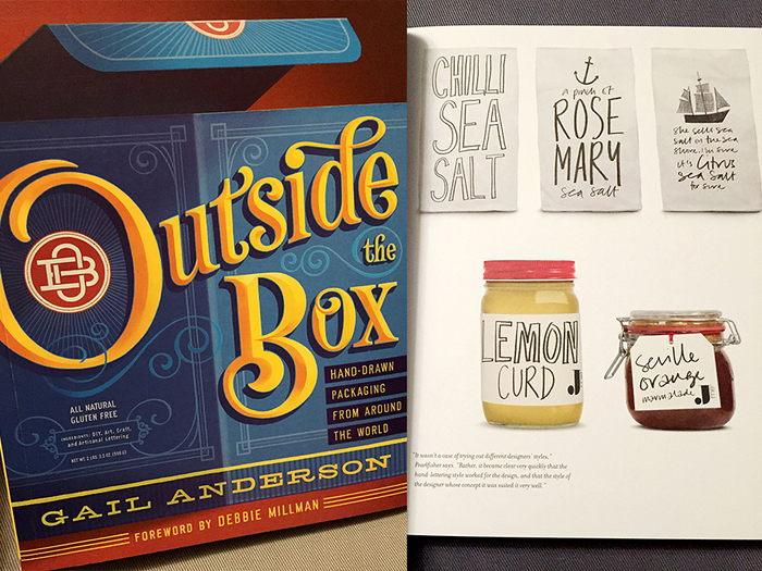
GAIL ANDERSON / Outside the Box: Hand-drawing packaging from around the World

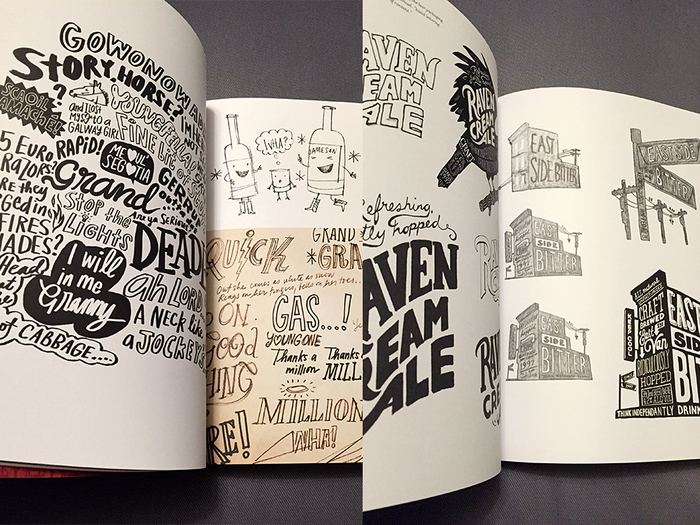
Developing page layouts and conceptual thinking already starts by hand, so why stop there? This enjoyable, image-heavy collection of international packaging case studies (with a foreword by the always memorable and reflective Debbie Millman), covers a delightfully diverse range of handdrawn styles and techniques from graphic designers, illustrators and lettering artists alike. Four categories are covered, ranging from the spontaneity of DIY and the looseness of ART, to heightened details found in CRAFT and the obsessively intricate complexities of ARTISANAL works.

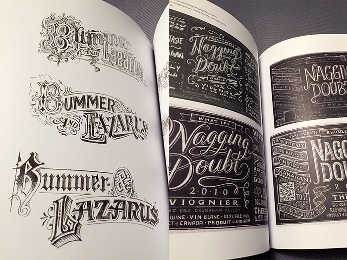
The best part are the numerous close-up process sketches, explorations and developmental moodboards shared at length, along with backstories of how these diverse projects came together in their own way. In some cases, photos documenting drawing, painting and lettering processes are shown with support illustration or sketches where applicable. I appreciate how the personality of each letterer’s hand was retained right to the final product, as well as some exhaustive variations that were vital to informing what the final outcome would or should become. Some might see it as a waste of time and energy to work so broadly from a design development standpoint, but every sketch is beautiful in its own way and deserves its time in the sun, especially in this manner.

And if that wasn’t enough, the book concludes with a not so little section titled, “Inside Outside the Box” with 7 pages of author Gail Anderson and Joe Newton’s super-tight lettering for the book’s four title spreads. I’d be hard-pressed to choose my favourite single version of each word, as they’ve skillfully and artfully demonstrated that although one may be a front-runner for each concept, there's always more than one way to solve a design problem. So rather than hunt around for the perfect typeface or font for your design problem, the solution might be right at hand. Or left. Or both, if you’re ambidextrous.

––––––

Whether one is a graphic designer, typographer, art director, artist, illustrator or simply anyone who thinks conceptually, drawing skills can really help translate ideas while giving an authentic, human quality to the work itself. Doing things by hand provides a physical documentation of the creative process, which can be revisited time and again with new eyes or new discoveries. I love it because it’s faster than any computer or OS on the market, it’s not led by any specific single tool or external power source, and it’s considerably affordable (a hotel pen + any office notepad will do!). It’s so easy as long as you have the most essential piece in the puzzle….time. A long stretch of it or chunks of time on a regular basis both work, but making or having the time is what makes BY HAND one of the best ways to be creative.

So what kind of work will I take up with my time? Skillshare.com has some great online classes (Spencer Charles and my current classes with Tom Froese or Martina Flor are noteworthy), I’ve joined an local lettering club and I will commit regular time to daily practice. I’ve also had a cover redesign of Helm Wotzkow’s 1952 book “The Art of Hand Lettering” on my TO DO list for months. Then there are sketches of fun ideas to be fleshed out more… Whatever time affords me, I hope you, too, will turn your downtime into uptime, simply by using your hands.